Jewel Tone Living Room: A Design Guide for 2026


The homeowner walks into the Grants Pass showroom with a photo saved on the phone, usually an emerald sofa or a sapphire chair, and the first question is the same. Will this look rich in a real living room, or will it swallow the space? That's the right question, because jewel tones work best as a system, not as a paint-chip gamble.
A jewel tone living room has staying power because it isn't built on one loud color alone. It's built on balance, proportion, and layered contrast, the same logic behind the classic 60-30-10 rule that still keeps strong color livable House Beautiful. In Southern Oregon homes that already lean neutral, that structure gives us room to add personality without making the room feel busy.
The smartest move is simple. Pick one anchor piece, build outward, and let the room breathe. That approach works whether the room is in Grants Pass, Medford, Central Point, Ashland, or anywhere across the Rogue Valley.
Why a Jewel Tone Living Room Is Worth the Leap
A homeowner can stand in the showroom, point at a deep green sofa or a blue velvet chair, and still worry the room will feel like too much at home. The fix is simpler than the fear. Jewel tones work best when the room gives them structure, so the color reads as confident instead of loud.
Jewel tones read as depth, not gimmick
Jewel tones are gemstone-inspired colors, the kind that carry weight and presence without needing a pattern to do the work. Emerald, sapphire, ruby, amethyst, burgundy, and deep magenta all sit in that family, and each one gives a living room a moody, inviting feel Wayfair. In a real room, that depth matters because texture, furniture scale, and light all land at the same time.
Consumer taste research shows the appeal is selective, not universal. In a Living Spaces survey, 19% preferred a jewel-tone color palette for the living room, compared with 68% who preferred neutrals and 18% who preferred earth tones, while 49% preferred gray sofas Living Spaces survey. That puts jewel tones in a practical sweet spot for homeowners who want stronger style without giving up familiar furniture choices. The same instinct shows up in these living room trends for 2025, where color still has to work with real daily use, not just look good in a photo.
Practical rule: Keep the room grounded in neutrals first, then let the jewel tone carry the mood.
That is why the look has staying power. It does not depend on chasing one color of the moment. It depends on using a saturated hue with restraint and giving it the right supporting pieces.
What makes the look work in real homes
Southern Oregon homes often already have the right bones for jewel tones, neutral walls, natural wood, and furniture that does not need replacing just to try something new. A jewel tone living room works with that base because it adds contrast instead of fighting the room.
For a homeowner in Grants Pass or Medford, the move is to choose one anchor and let the palette grow around it. That is the difference between a polished room and a color experiment that gets old fast.
When the room feels intimidating, start with the anchor, then decide what can stay quiet around it. The rest gets easier quickly.
Building Your Palette with the 60-30-10 Rule
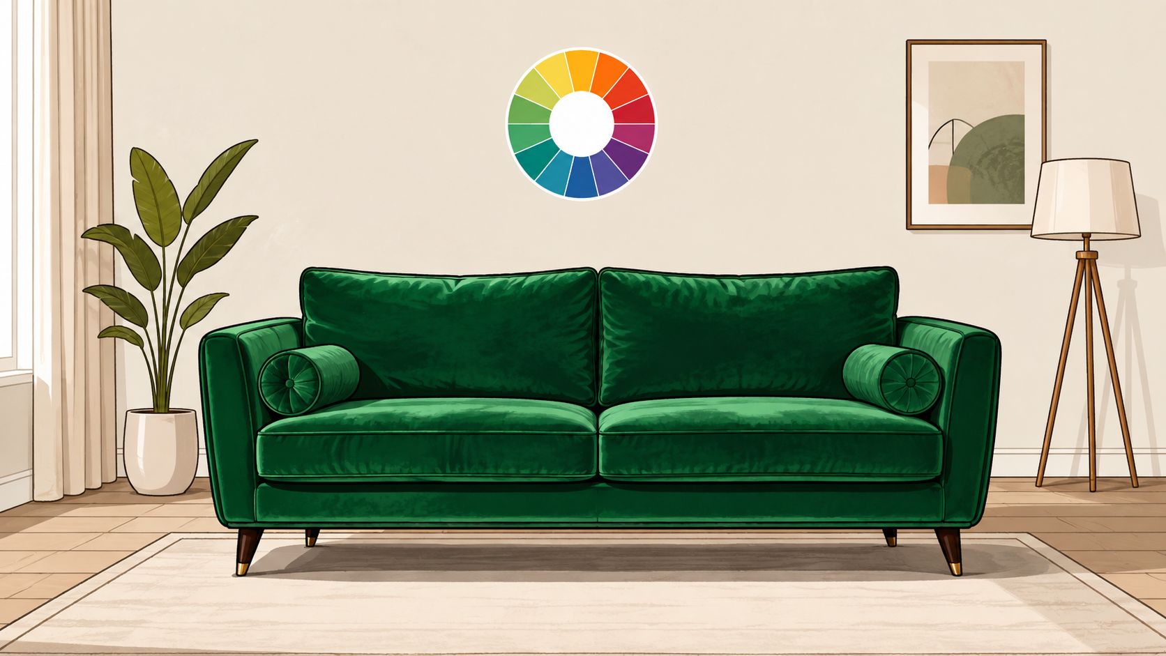
A jewel-tone room needs structure, not just taste. Start with the classic 60-30-10 rule, with 60% dominant color, 30% supporting shade, and 10% accent color. It keeps saturated color from swallowing the room and gives the whole scheme a clear order. For a clean starting point, Painters North Shore advice on pairing saturated palettes follows the same logic. For planning the full mix before you buy, this color palette guide helps turn a room idea into a real shopping list.
Start with the 60 percent
The dominant color should be the calmest part of the room. In most living rooms, that means the walls, a large rug, a neutral sofa, or some combination of those pieces. If the space already has a busy floor or a strong fireplace surround, let that dominant share stay quiet and let the jewel tones do the talking elsewhere.
Put the 30 percent on support duty
The supporting shade should carry the next biggest visual load. That might be a jewel-toned sofa, drapery, a pair of chairs, or a sectional in a richer finish. Emerald reads lush, sapphire feels cooler and sharper, ruby brings warmth, and amethyst feels softer and more layered. Burgundy sits in a deeper, more grounded zone, which is why it often feels easier to live with in a family room.
Use this layer to give the room its character. A teal chair against a neutral wall, or a velvet sofa beside a quiet rug, adds presence without making the whole room fight for attention.
Use the 10 percent for the sparkle
The accent color is where the room gets its edge. Pillows, art, a single chair, or a ceramic lamp can carry that last bit of color without turning the room theatrical. In a Southern Oregon home with generous daylight, even a small accent can shift the mood from plain to finished. House Beautiful makes the same point, saturated tones work best when they are balanced instead of scattered.
Here's a simple way to test it at home.
- Pick the dominant base first. Start with what already lives in the room, or the calmest piece you plan to keep.
- Choose one jewel tone as the supporting color. Use it on the largest new item, usually upholstery.
- Reserve the smallest dose for a third color. Keep that note tight so the room does not splinter.
- Check the palette in morning and evening light. Jewel tones shift a lot as the day changes, especially near windows.
- Bring the palette notes into a showroom visit. A written plan beats guessing in the aisle.
For homeowners trying to make the leap in Grants Pass, one good anchor piece is often enough to get the palette moving in the right direction.
Read the room like a paint sample, not like a promise. Light changes everything.
Choosing the Anchor Piece That Sets the Tone
A jewel tone living room gets stronger when one piece takes the lead. Spread the color across too many small items and the room loses direction. Pick one anchor, then let the rest of the space support it.
Sofas carry the most authority
A jewel-toned sofa makes the clearest statement in the room. It works best with enough visual breathing room around it, lighter walls, a calm rug, and wood or metal accents that stay in the background. For households that want a polished look and expect the sofa to do most of the visual work, this is the strongest choice.
A sofa also gives the room a clear point of view in a showroom setting. A deep green or blue sofa can set the tone for pillow fabric, artwork, and the smaller pieces that follow. Gates Home Furnishings carries options like a Stanton Queen Sleeper Sofa 643 that can be ordered in hundreds of colors, which makes it a practical route for a jewel-tone palette when flexibility matters.
Recliners and sectionals bring comfort into the conversation
A recliner or sectional in a jewel tone is the smarter move when the room is built for everyday lounging. It gives the color more surface area without forcing the whole scheme to revolve around a formal focal point. For families, that often works better, because the room stays relaxed while still feeling intentional.
A deep burgundy recliner can add richness without pushing the room into a dramatic color story. The shape matters too. A bulky piece in a saturated color can feel heavy, while a more refined silhouette keeps the color looking composed.
Statement chairs are the safest first step
A single velvet chair is the easiest entry point for anyone still unsure. It brings in the palette without locking the room into one big decision. That makes it a smart choice for renters, first-time homeowners, or anyone who wants to test the look before committing to a larger piece.
The right companion pieces make the difference. Gates Home Furnishings' Unique Finds program, with reclaimed wood and teak statement pieces, gives jewel tones something grounded to sit against. Their statement furniture pieces do the same job, giving the room one strong focal point instead of a handful of half-measures.
If comfort needs to be tested in person, the 30,000-square-foot showroom in Grants Pass is the place to do it. That matters with jewel tones, because a fabric can look elegant on a screen and feel entirely different when it fills a real room.
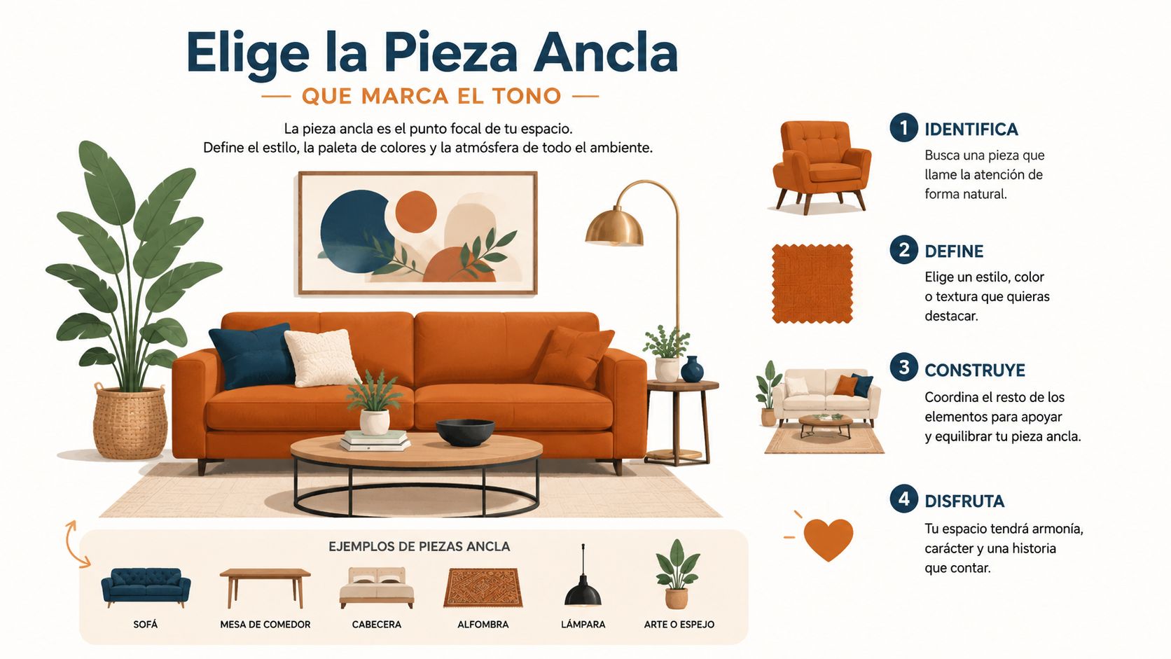
The best recommendation is simple. Let one major piece carry the strongest color, then keep the rest disciplined. That gives the room confidence.
Layering Textiles and Finishes for Depth
A jewel-tone room goes wrong when every surface shouts at once. It goes right when the textures do the heavy lifting. Rich color needs contrast, and contrast comes from materials that catch light differently across the room.
Pair soft with structured
Velvet belongs next to linen, wool, wood, or leather. That mix keeps the jewel tone from looking flat. A velvet pillow on a linen sofa feels deliberate, while a wool rug under polished furniture gives the eye a place to rest.
Brass and aged gold work especially well with cooler jewel tones because they add warmth without looking shiny or showy. Mirrors and glass tabletops help, too, because they bounce light back into the room. A room full of matte, saturated surfaces can feel closed in fast.
Design rule: Mix at least one soft texture, one grounded texture, and one reflective finish.
Use finishes with restraint
Too much sheen is the quickest way to make the room feel dressed up in the wrong way. Satin or gloss on every surface can make jewel tones look stiff. A matte wall, a woven rug, or a natural wood table resets the room so the richer pieces feel intentional.
That's where pattern balance matters. This guide on mixing patterns and finding balance fits well when pillows, rugs, and drapery need to work together without turning the room noisy. It's the same principle at work here, just with texture instead of print.
A small comparison helps when choosing what to add first.
| Jewel Tone Texture Pairings | | |
| Primary Surface | Best Texture Pairing | Why It Works |
| Velvet sofa | Linen pillows | Softens the richness and keeps the room casual |
| Painted wall | Wool rug | Grounds the color and adds visual weight |
| Leather chair | Brass lamp | Warmth balances the depth of the upholstery |
| Satin drapery | Matte wood table | Stops the room from feeling overly shiny |
| Colorful ottoman | Glass side table | Lets the color stay bold without crowding the floor plan |
One useful styling reference for lighter accent work is the way a pale blue cushion can cool down richer surroundings. Quote My Wall's cushion styling advice shows how a softer textile note can keep a strong palette from feeling too dense. The same idea holds in a jewel-tone room, one lighter, calmer piece makes the richer colors look more expensive.
The goal is not more stuff. The goal is better contrast.
Lighting the Room So Colors Stay Luminous
Lighting decides whether a jewel-tone living room feels lush or just dark. That's not a style opinion, it's how saturated color behaves in real space. Under weak light, deep color collapses. Under layered light, it gets depth.
Build the room in three layers
Ambient light is the base, the ceiling fixture, floor lamp, or overall room glow that keeps the space usable. Task light belongs near reading chairs and beside sofas, where people sit. Accent light should hit art, plants, a textured wall, or a focal piece so the room has dimension after sunset.
Jewel tones change throughout the day, especially in rooms with variable daylight. A color that looks clean in the morning can feel heavier by evening if the room has no reflective surfaces. That's why Southern Oregon homes with strong natural light should still plan for the darker hours.
Keep dark rooms from sinking
If the room doesn't get much daylight, don't drench every wall in a saturated color. Put the jewel tone into furniture and textiles instead, then use cream walls, mirrors, a lighter ceiling color, or other light-bouncing surfaces to keep the room from feeling boxed in. A fully color-drenched room can be beautiful, but only when the lighting supports it.
Under-lighting is the failure mode. Everything else is fixable.
Warm light helps here because it lets jewel tones feel rich instead of harsh. A white ceiling can work in some rooms, but a lighter coordinating ceiling often softens the transition in a more forgiving way. That keeps the eye moving instead of snapping hard between surfaces.
This lighting guide is worth keeping nearby when the room needs both atmosphere and practical brightness. The lighting plan should be decided with the furniture plan, not after the room is already finished.
For homes in Grants Pass, Medford, and Ashland, the best move is to test the fabric under both daylight and lamp light before signing off. Jewel tones reward that extra check.
Layout, Scale, and Where to Place the Statement Piece
Color alone doesn't finish the job. A jewel tone can look powerful in the wrong spot and weak in the right one if the scale is off. The room needs one clear focal point, then enough open space for that piece to land.
Place the bold piece where the eye naturally goes
A jewel-toned sofa or sectional belongs where it can anchor the room without blocking the path. That usually means facing the main focal point, not fighting windows and doorways for attention. If the room has a fireplace, media wall, or a strong exterior view, the bold piece should support that centerline instead of competing with it.
Let the room size set the level of color
A smaller room can absolutely handle a jewel-toned chair. That's often the cleanest solution, because one accent seat adds character without making the room feel packed. In a larger Rogue Valley great room, a sectional or color-drenched upholstery can work because there's enough square footage for the color to breathe.
Wood tones and metals matter here too. Dark wood can deepen a jewel-tone scheme, while lighter wood and brushed metal can keep it from feeling heavy. The goal is to repeat the color in a way that feels intentional from the front door to the far wall.
Best placement cue: Put the richest color where the room needs a focal point, not where it needs more visual noise.
Keep traffic flow open
The best-looking room still fails if people have to squeeze around it. Leave easy paths between seating areas, doorways, and side tables. A strong color reads better when the room moves well.
That's why layout and palette need to be planned together. A bold sectional in one corner, a reclaimed wood table in another, and a restrained wall color in between can make the whole space feel calm even when the upholstery is saturated. It's not about filling every edge, it's about shaping the room around the statement.
Maintenance, Longevity, and Bringing It All Together
The smart question isn't just whether a jewel tone living room looks good today. It's whether it still feels right in a few years. Current design direction is leaning toward dustier jewel tones with gray or brown undertones, which makes the palette feel softer, warmer, and easier to live with than a glossy, high-contrast version.
Lean classic or soften the edge
A classic emerald sofa with brass accents still works. So does a deeper sapphire or burgundy if the rest of the room stays calm. The 2026 shift asks for a little less shine and a little more texture, especially in rooms meant to be used every day.
That softer direction is the safer bet for longevity. It keeps the room from feeling themed, and it helps the color sit naturally with wood, stone, woven fabric, and other lived-in materials. A jewel tone should feel like a strong choice, not a costume.
Care depends on the material
Velvet needs regular brushing so the pile stays even. Performance fabrics are the easiest option for households that expect spills, pets, or heavy use. Richly dyed leather develops character over time, but it should still be kept clean and conditioned so the color stays even.
Protection matters on every one of those finishes. Gates offers Gates Care Shield for accidental spills and tears, which is the kind of coverage that makes sense when the room includes a high-use statement piece. If the sofa or chair is the heart of the room, it deserves more than hope.
A few practical steps help protect the investment:
- Test the fabric in the showroom. Touch matters as much as color.
- Choose the right finish for the household. Performance fabric beats perfection every time in a busy home.
- Use light, not glare. The room should flatter the upholstery, not fight it.
- Keep backup textiles simple. Neutral pillows and throws make the bold piece last longer visually.
- Plan delivery and setup. A heavy piece should arrive ready to live in, not ready for another weekend of work.
That's where the rest of the process comes together. Families in Southern Oregon can test pieces in the Grants Pass showroom, compare La-Z-Boy, Flexsteel, Ashley, and Beautyrest offerings, look through Unique Finds like reclaimed wood and teak accents, and use Gates Easy Pay with $0 down, 6-month interest-free options, and no-credit-needed options when budget timing matters. White-glove delivery finishes the job with professional assembly and mattress haul-away, which is exactly what a real household needs after the sale.
A jewel-tone living room doesn't have to be risky. It just has to be built with discipline, the right texture, and a piece that earns its place.
Visit Gates Home Furnishings to test jewel-tone upholstery, compare anchor pieces, and build a living room that feels rich without feeling forced. Our Grants Pass showroom gives Southern Oregon homeowners a place to see the color, feel the comfort, and choose the right finish with confidence.